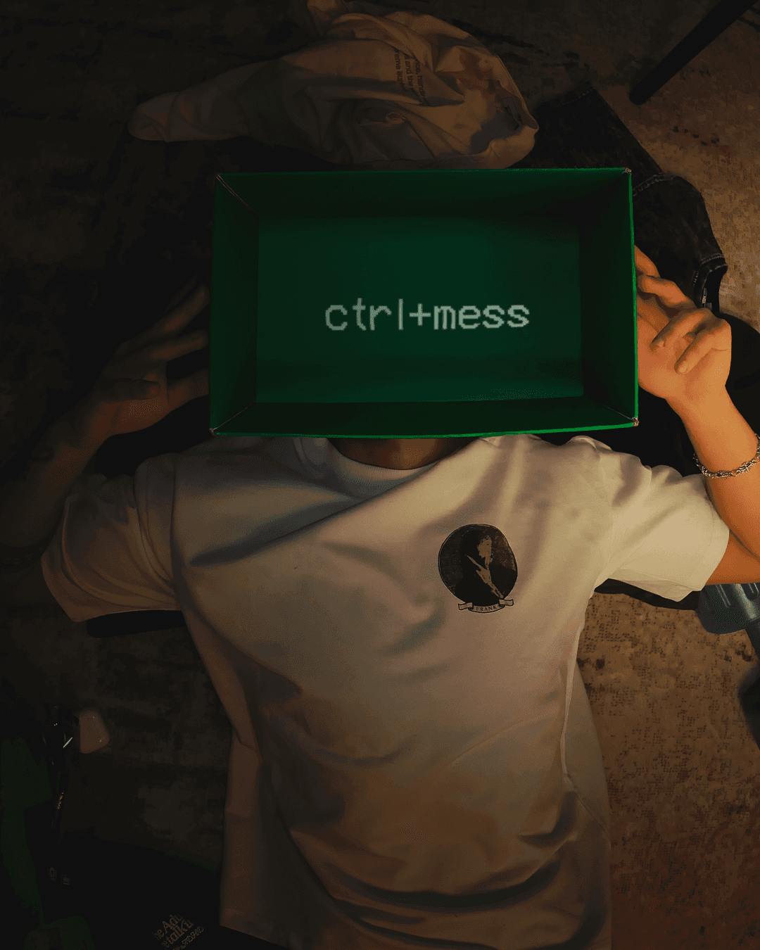
I got to be part of the early creative team shaping the world around their first release Geezer. This included working on copy, moodboards, visual language, and some merch ideas. It was a pretty collaborative process across the board.
Launch copy
Visual identity system
Merchandise design including hoodies and graphics
Moodboard creation and visual tone setting
Typography and layout for digital and social
Experimental copy around the idea of Texas Pop
BLUSH IS
A genreless space. A rotating cast. An undefined identity.
No fixed medium
No permanent members
No set formula
Together with the artists, I helped craft a creative world rooted in raw emotion and youthful chaos. The vision drew from Houston, queer Americana, lo-fi cinema, and underground zine culture.
VISUAL DIRECTION
Red and electric blue became the core color palette. Loud. Direct. Unapologetic. The graphics were designed to feel like bootleg flyers, protest posters, and personal journals.
Typography was used as a voice. Big, heavy, and deliberately imperfect. Layouts took cues from DIY print culture and hometown nostalgia.

MERCH
Helped around the design for the first Blush Pride hoodie. A washed indigo pullover that introduced a visual identity made for reprinting, remixing, and reinterpreting. This expanded into a series of stickers, patches, and poster graphics.

This was one of those projects where everyone brought something different to the table. Felt more like a creative playground than a campaign.
And it’s still unfolding.